Brave Ground
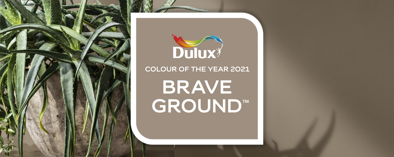
Introducing ‘Brave Ground’ - the Dulux Colour of the Year 2021
Every year, the colour specialists at Dulux create an inspiring new shade; their ‘Colour of the Year’. For 2021, it's Brave Ground, a warm, natural neutral that bring a bolstering, balancing feel to any room. Here’s why it’s the color of the moment, plus inspirational ideas for combining it with other shades to transform your home.
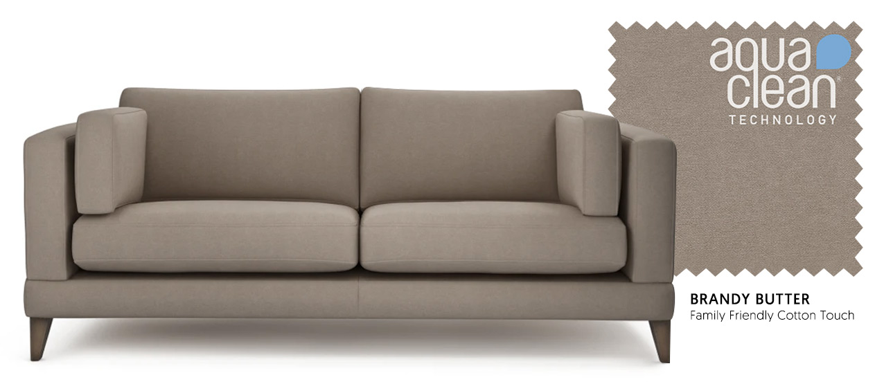
Mallory 3 Seater Sofa in Family Friendly Cotton Touch - Brandy Butter
Warm neutrals are a great choice for interiors as they are welcoming and cozy but create the perfect base onto which you can easily add other colours to change your look from season to season. Our ‘Brandy Butter’ fabric - you’ll find it in the Family Friendly Cotton Touch collection – is the perfect match for Dulux’s Brave Ground. You can order a swatch of this or any of our beautiful fabrics for free.
Combining Brave Ground with other colours
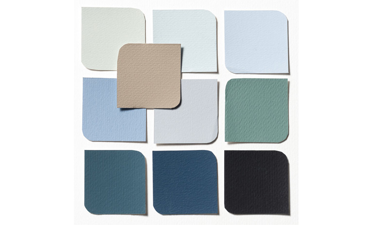
Dulux has put together four palettes to show how amazingly versatile Brave Ground is. Whether you want cool, calm and collected or modern and expressive, you can use the Colour of the Year to great effect in any interior.
EARTH PALETTE
“Echoing the tones of the sea, the sky and the soil, these earth shades provide a connection to the natural world around us. Bringing the outside in, they are authentic and grounding colours that work naturally together.”
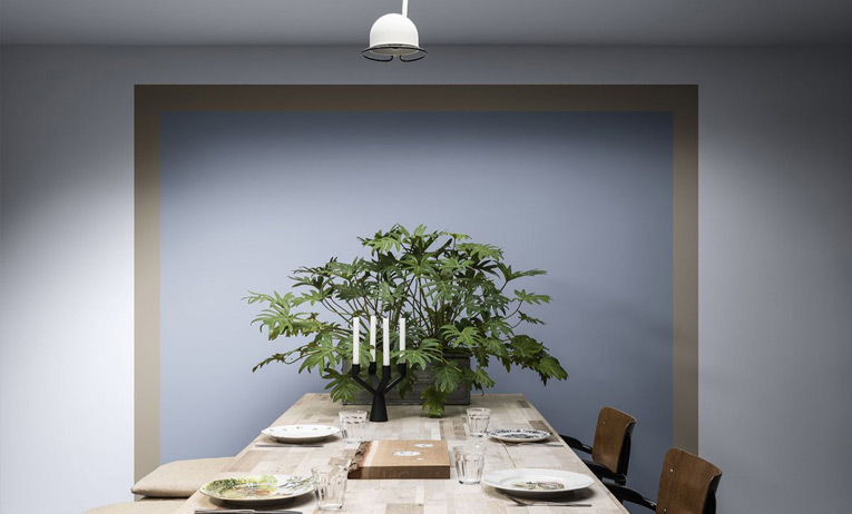

Get the look with Walled Garden (Vintage Velvet) and Blue Matcha (Family Friendly Cotton Touch)
We love blues at The Lounge Co., so are big fans of this colour scheme. Adding cool shades of grey, blue and teal to Brave Ground creates a calming interior that’s elegant yet contemporary. We’ve set our Holly 3 Seater in Brandy Butter - a contemporary sofa in a neutral fabric - against a wall in Graham & Brown’s ‘Little Boy Blue’ paint and accessorised with tones of teal, grey-blues and gold.
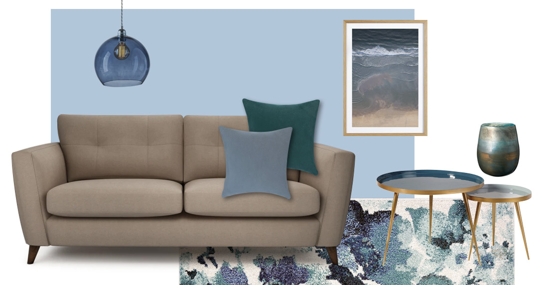
From left to right: Holly 3 Seater in Brandy Butter. Little Boy Blue paint by Graham & Brown, Rowan Pendant Lamp by Pendalier, 'At the Beach' print by Juniqe, Olja Vase by OKA, Nest of Tables by Maisons du Monde, Watercolour Rug by Homebase.
TRUST PALETTE
“Earth tones from across the globe, these unifying shades reflect everyone. Warm neutral greys and browns, these colours complement each other and encourage connection, collaboration and a sense of harmony in the home.”


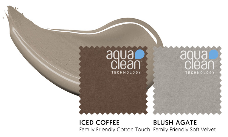
Get the look with Iced Coffee (Family Friendly Cotton Touch) and Blush Agate (Family Friendly Soft Velvet)
EXPRESSIVE PALETTE
“Stand-out shades of reds and pinks, balanced with soft neutrals, these are colours that can add verve and vitality to our homes, allowing us to create an individual space that energises, surprises and reflects who we really are.”


Get the look with Watermelon Sorbet (Family Friendly Cotton Touch) and Cotton Candy (Velvet Touch)
The great thing about neutrals is they act as a blank canvas. A bright pink velvet sofa - a stunning twist on the traditional - really stands out from a wall painted in Brave Ground. We’ve used shades of blush pink and coral from the Expressive palette to accessorise our Rose Sofa in Summer Punch.
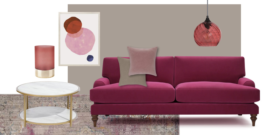
From left to right: Cambridge Rug by Wayfair, Tanzanite Coffee Table by Wayfair, Armstrong Vase by Wayfair, 'Eclipse' print by Desenio, Brave Ground paint by Dulux, Rose 2.5 Seater in Summer Punch, Carricola Pendant Lamp by Ledkia.
TIMELESS PALETTE
“Inspiring shades of yellows and ochres, alongside soft neutrals, these are tones that can help create a backdrop that embraces old and new. Energising without being overpowering, they bring positivity and balance to a space.”
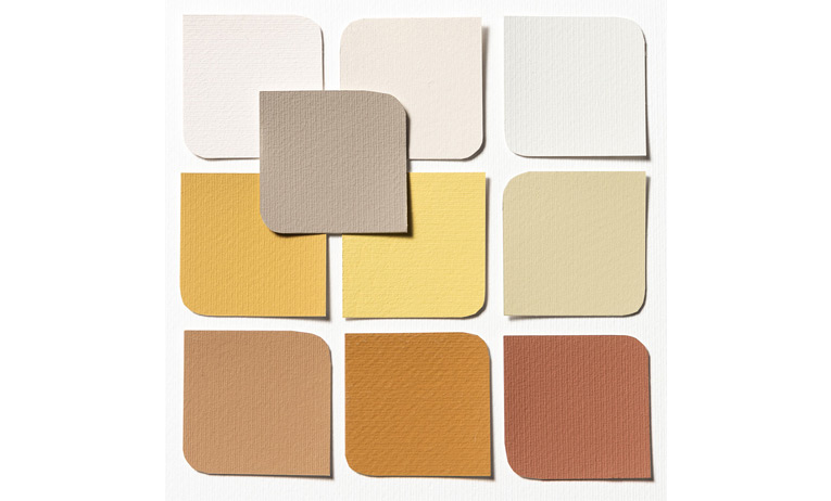


Get the look with Buttercup Meadow (Velvet Touch) and Rusty Gate (Velvet Touch)

Harness the timelessness of neutrals
Whether you choose to make your walls a blank canvas or keep your sofa nice and natural, we think balancing other colours with a warm neutral is a great idea. It acts as the glue to keep a scheme together and provides harmony to shades that could otherwise be too bold for most.
The Lounge Co. is the perfect place to buy a sofa, neutral or bright. With British quality you'd expect as prices you wouldn't, you're guaranteed to find the perfect sofa for you and your home.
Of course, you could keep your whole interior in a palette of neutral tones if you wanted a look that’s soft, soothing and Scandi-inspired. Head to Pinterest to find more inspiration on this designers favourite. Beige is most definitely back!